Alena Romero

Alena Romero

The icon I chose was Pikachu because of how impactful the Pokémon franchise has been on me since I was a child. Through my feedback, people said that Pikachu represented childhood and nostalgia, and those were two ideas I wanted to capture with my icon. I have grown up playing all the Pokémon games and getting various Pikachu memorabilia, so having other people acknowledge that idea of nostalgia was encouraging. In my print, I have Pikachu and I playing video games because those represent two of the happiest memories from my childhood. I wanted to capture my childhood memory, but also portray it as a scene anyone else could put themselves in. 


Source Image:

Art History Student Response to Alena Romero: 

By Jared Hansen:

My icon is Pikachu, from the Pokemon franchise. My initial reaction to seeing this icon was excitement from recognition. When I sit and think of Pikachu as an icon, what repeatedly comes to mind is advertising. It’s literally used everywhere for the Pokemon franchise, not to mention. It also makes me think of others being happy and carefree, as that is normally the mood you’ll see people in when around Pikachu. Thanks to merchandising deals, Pikachu was spread everywhere in the late 90s/early 2000’s to help promote other products to children and raise the popularity of the quickly growing Pokemon brand. His simple, soft, bright yellow, and distinct design made him very likable and marketable, thus making him a well known icon to even those who have no idea as to what Pokemon is or how it works. 


Kraak, V. I, and M Story. “Influence of Food Companies’ Brand Mascots and Entertainment Companies’ Cartoon Media Characters on Children’s Diet and Health: a Systematic Review and Research Needs.” Obesity Reviews 16, no. 2 (2015): 107–26. https://doi.org/10.1111/obr.12237.

By Cecilia López: 

My icon is Pikachu, my initial reaction to this icon was a sense of familiarity and nostalgia. I recognized the icon despite never watching Pokemon, which is telling on how iconic it is.  Perhaps this icon could represent a sort of leeway into the liking of Japanese animated series. The article cited below talks about the impact the AR mobile game, Pokemon Go, had on peoples’ physical and mental health. After reading the article I was able to get a feel about how strong of a sense of belonging there is surrounding the game/series from which the icon Pikachu is a part of. 


Chong, Yvette, Dean Sethi, Charmaine Loh, and Fatimah Lateef. 2018. “Going Forward with Pokemon Go.” Journal of Emergencies, Trauma and Shock 11 (4): 243–46. https://doi.org/10.4103/JETS.JETS_87_17.


Alyssa Hightower

Alyssa Hightower

The evil eye represents protection and has risen in popularity in mainstream pop culture throughout the years. It is a symbol that has lived for a long time dating back to ancient Egypt and is known in almost every culture. In today's climate with Covid-19, there is a lot of controversy on if you should be vaccinated or not. I wanted to create something people can connect to by instantly recognizing the evil eye and protection from bad energy. This evil eye is yellow which is protection from bad health and is something we all need today.

Source Image:

Art History Student Response to Alyssa Hightower:

By Diana Gonzalez:


My initial reaction to the evil eye icon was familiarity. I have associations with this icon that have to do with spirituality and protection from negative “energy”. Protective amulets such as the blue evil eye symbol are not just a new "trendy" symbol to wear today, they have their roots in superstition beliefs that date back to ancient Egyptians. This belief of the evil eye entails that people can cast the evil eye onto someone with a malevolent look, and this emits harm or bad luck onto the subject of your stare. In many eastern cultures, the evil eye often has the distinct shade of lapis blue to protect the amulet's wearer from someone giving you an "evil eye." 


Medow, Norman B, and George M Bohigian. 2000. “Many Cultures Have Tried to Thwart the Effects of Evil Eye : Amulets, Symbols, Colors, Gestures Have Been Used as Protection.” Ophthalmology Times 25 (12): 12–.


By Alexis Macdonald:

My icon is the evil eye. My initial reaction was, oh I know that piece, because it is pretty commonly owned by people both that I know and that I have seen by strangers. The associations I have are that the evil eye is a symbol of protection from evil, it is a spiritual piece, and that it is supposed to ward off evil. What seems iconic about it is the deep blue hue, and the depiction of an eye in the center. The source explains the universal meaning of how the eye is supposed to ward off evil energy and offer divine protection, as well as show how culturally widespread its meaning is, ranging from Europe to the Philippines. The evil eye is a symbol of biological fear that was created from superstitious beliefs and enacted into the tangible world.

Migliore, Sam. 1997. Mal’uocchiu : Ambiguity, Evil Eye, and the Language of Distress / Sam Migliore. Toronto, Ont: University of Toronto Press.


Cecilia Lopez

Cecilia Lopez

My icon is Tui and La, which are the moon and ocean spirits from the animated series Avatar the Last Airbender (ATLA), as well as yin and yang, due to Tui and La being a variation of that icon. My print is sort of an exploration of how far I could vary Tui and La/ Ying and Yang, while still having it be iconic. ATLA had already stretched yin and yang once by having the Koi fish take the image of the yin and yang symbol, so I decided to stretch the Koi, by making them remain opposites, however in an extra cartoony way

Source Image:

Art History Student Response to Cecilia Lopez:

By Junpeng Lian:

The icon I chose is Tui & La Avatar. This icon is consistent with two cypriniformes, one of them is white and the other one is black. These two fishes form a circle. And the background is aYinYang symbol. Based on my background of traditional Chinese culture, the YinYang symbol as the background of this icon also brought me some familiarness. According to the source, Yin Yang suggests paradox as interdependent opposites instead of exclusive opposites. He also argued that “Yin Yang needs to be adopted as the philosophical foundation for the study of a new conceptualization of culture that is more embracive and holistic in nature than the current cultural models.” 


Fang, Tony. “Yin Yang: A New Perspective on Culture.” Management and Organization Review 8, no.1 (2012): 25–50.https://doi.org/10.1111/j.1740-8784.2011.00221.x.


Elizabeth Ballard-Branco

Elizabeth Ballard-Branco

The icon I submitted was an image of a modern fire alarm found in Kadema 107. I chose this image for a number of reasons, the primary one being that many people are very familiar with fire alarms, having been surrounded by them all their lives. I was living in Santa Rosa during the wildfires of 2017 and 2019 and have been interested in finding a way to connect those experiences to my work, and thought that this would be a good opportunity to. The ART 111 class responded to my image with the history of fire alarms, touching on the fact that before the development of the fire alarm that is most similar to our modern version, a person would have to stay behind and physically crank the alarm to warn others of danger, placing their own lives at risk. In my final image, I drew inspiration from religious iconography, creating a gold halo around a historically-inspired fire alarm. Below I included an industrial factory area, though these style factory buildings look similar to houses, bringing together the past and the present. I created a blend roll from orange to grey in the smoke, replicating the skies I grew familiar with during my time in Santa Rosa. This final image synthesizes the historical context provided by my ART 111 colleagues with the present experiences we face with our wildfire seasons.

Source Image:

Art History Student Response to Elizabeth Ballard-Branco:

By Emma Montalbano:


The icon is of a fire alarm. My initial reaction to this icon is familiarity, the fire alarm is something that must be in public buildings in the country we live in. As children, we are familiar with them as an untouchable item and often have an association with clichés of being pulled by a non-rule follower or prankster. On second look, I associate this with destruction which fire usually brings in these scenarios. The idea of loss and destruction associated with the alarm makes it symbolically iconic. The writing explores a brief history of fire and examines it in a scientific manner from its birth on earth. The ideas of fire as a monopolized item to early hominins contrast with explorations of fire as a vast combusting factor of the early earth. Fire as power for humans or nature is a significant theme in the writing that I found relevant.

Pyne, Stephen J., and William Cronon. “INTRODUCTION: KINDLING.” In Fire: A Brief History, xv–2. University of Washington Press, 2001. http://www.jstor.org/stable/j.ctvcwnf8f.5.

By Mike Saechao:

The color red being assigned to the Fire alarm fits in the same way that fire trucks are red. The vibrant red makes for easy visibility and human psychology of the color red being associated to fire or warning color as they are in nature. Most venomous lifeforms have vibrant colors on their bodies to indicate they are toxic such black widows and that red mark. In this case, it is flipping the meaning of red meaning toxic into a marker to go towards to in case of an emergency. According to Hua Henning, the importance of firefighting gained traction quickly in the industrialization era as the importance to protect property and lives for economic purposes. With the rise of capitalism came the rise of protecting capital interests that stimulate the economy while also serving possible political interests.

Hua-Henning, Jan. "Opening the Red Box: The Fire Alarm Telegraph and Politics of Risk Response in Imperial Germany, 1873–1900." Technology and Culture 62, no. 3 (2021): 685-708. doi:10.1353/tech.2021.0104.


Emma Montalbano

Emma Montalbano

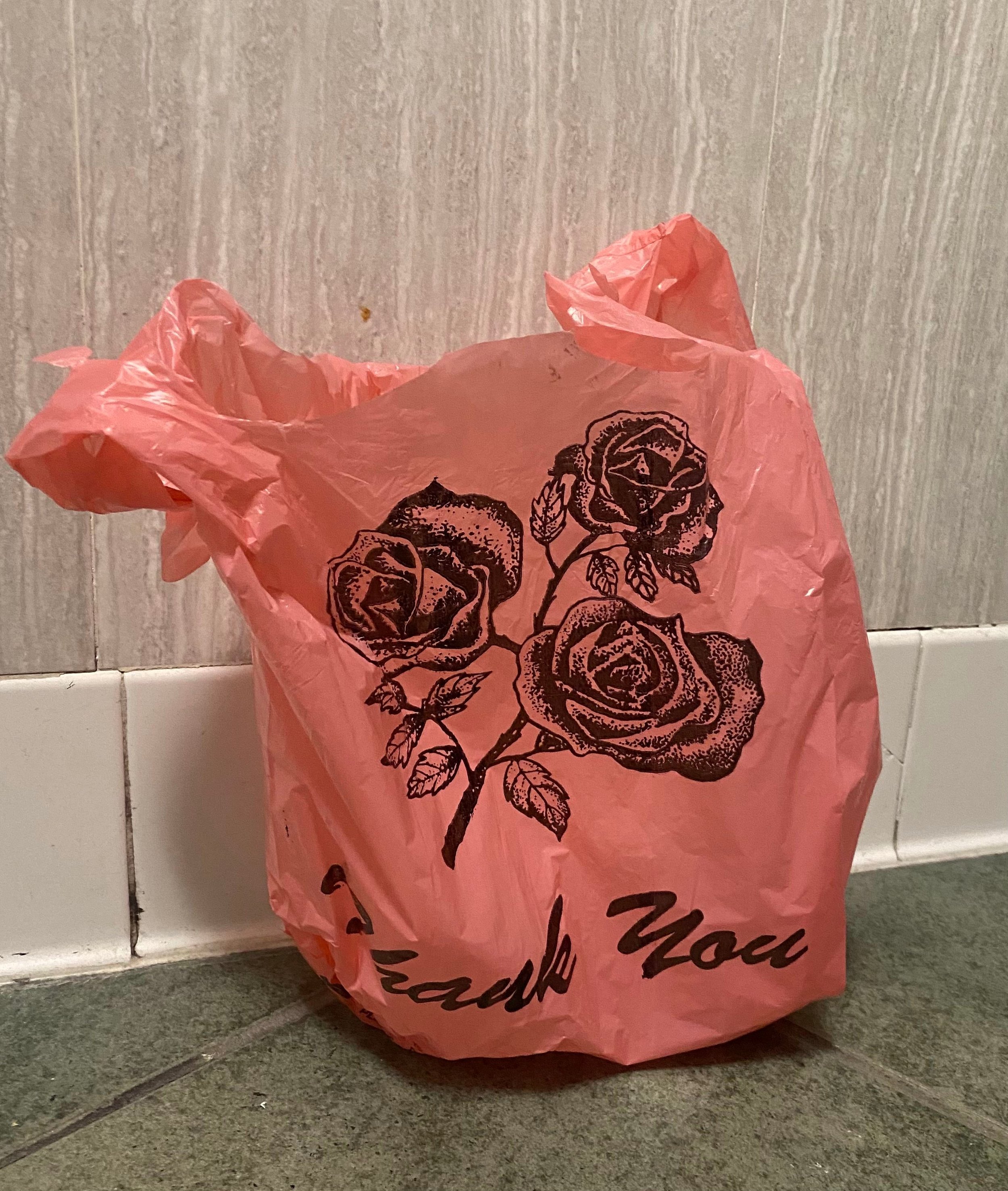
When asked the question “What is iconic?" I reflected on the need for something to be visually notable, conceptually complex, and uniquely interesting. This led me to the everyday item, “Reusable” plastic bags.

Reliquiae is made in connection with a series I have been working on titled "Reusable" an exploration of plastic bags, the aesthetically pleasing single-use items. The series connects to the environmental issues surrounding the world we live in today. Single-use items, specifically plastic, have been on the rise for most of my life. We continue to fill our natural resources with trash as the use of these convenience items grows. The bags pictured were collected in just this way, which I came across as they were on their way to being thrown away just after their very first use. As I explore alternative ways to recycle and comment on the impact we are making on the planet, these pieces investigate the irony between something made with single-use at the forefront while hiding behind the veil of reusability.

The piece was realized through collaboration with a Sacramento State Art History class, who commented on the iconography of the image. A note that inspired me and deviated from the common theme of environmental issues was the ascetic nature of the bags. Through the iconic flower, I paid homage to the reflections of my peers.

Source Image:

Art History Student Response to Emma Montalbano: 

By Sara Galvan: 

I did not expect a plastic bag to ever be considered an “icon”. The associations I have with this icon is using it as a grocery bag, carrying store bought items. It is harmful to the environment if not recycled properly. Ends up contaminating oceans and in landfill. The iconic part about this item is the rose image stamped on the front part of the bag. The article, “Need a bag? A review of public policies on plastic carrier bags - Where, how and to what effect?", explains how versatile the plastic bag has become to our society today. As consumers we are willing to purchase anything that makes our life easier no matter the cost it comes with. 


Nielsen, Tobias Dan, Karl Holmberg, and Johannes Stripple. 2019. “Need a Bag? AReview of Public Policies on Plastic Carrier Bags – Where, How and to What Effect?”Waste Management (Elmsford) 87: 428–40.https://doi.org/10.1016/j.wasman.2019.02.025 


By Alejandra Ruiz:

The first thing that comes to mind when I see this icon is consumerism. Plastic bags are synonymous with shopping, especially in the United States. What seems iconic about them is that they are present in almost every single big chain grocery store. On second look my icon stands for a more grim environmental reality. Plastic bags are not biodegradable and often end up littering landfills. Plastic bags are directly connected to the global consumer culture. On average a family of four in the United States would have collected approximately one thousand plastic bags. 


Battle of the Bag Deconstructing a Consumer Culture Icon / Canadian Broadcasting 

Corporation. 2009. New York, N.Y: Infobase. 

Genesis Torres

Genesis Torres

Definition of construction:

the process, art, or manner of constructing something

Definition of pylon:

A monumental mass flanking an entranceway or an approach to a bridge


Construction pylon comes from the research of what urban environments refer to as the traffic cone, which resembles an orange triangle in shape with a flat base. The use of traffic cones are commonly used to ward caution or can be used to created massive navigating systems for travelers to bridge through. I noticed the same connection to the use of pyramids in ancient Egypt, in the way our society use traffic cones to call attention to a particular location, and to alarm caution to any traveler that comes across the construction pylon. This research helped me in realizing how meanings can take many forms, yet a meaning is made through the act of history.


Source Image:

Art History Student Response to Genesis Torres:  

By Daniel Hernandez: 

I chose the construction barricade as my icon. My initial reaction to this icon, I immediately thought of the importance of cones. Construction barricades, otherwise known as caution cones, are used as warning indicators to guide through traffic for possible obstruction ahead. Construction cones have an important purpose in construction areas or zones, they are designated for the safety and protection of construction workers and others in the area. Construction cones, also known as traffic cones, are carefully placed to route or detour ongoing traffic through construction zones.  

"Patent Application Titled 'Traffic Cone and a Traffic Cone System' Published Online." Politics &Government Week,October 24, 2013, 10463. Gale Academic OneFile(accessed March 8, 2022). https://link.gale.com/apps/doc/A348057774/AONE?u=csus_main&sid=bookmarkAONE&xid=af735e4 


By Russell Yee: 

My initial reaction is that it's kind of a bland and overlooked icon. This icon can be seen everywhere and is often glanced over but not ignored. I associate a construction pylon with construction. The bright unnatural colors make it iconic. An additional association is an area that is dangerous that you shouldn’t go into. The variables for increased construction accidents were divided into 5 categories personal, business, temporal, material, and geographic. 

López Arquillos, Antonio, Juan Carlos Rubio Romero, and Alistair Gibb. 2012. “Analysis of Construction Accidents in Spain, 2003-2008.” Journal of Safety Research43 (5-6): 381–88. https://doi.org/10.1016/j.jsr.2012.07.005 


Hao Le

Hao Le

In making The Creation of Misophobia, I want to reflect on my own experience with germophobia. However, I do not share the same experience with other people who have germophobia where they would feel uncomfortable sharing things with others or having physical touch, etc. In my case, I’m just afraid of germs from unknown objects and my surrounding environment, especially the ones that my mind tells me those objects might have germs. For as long as I could remember, I would wash my hands with soap and water a lot, and later on, after moving to the US, hand sanitizer became an essential part of my life. Thus, this object is iconic to me as someone who experienced symptoms of germophobia, especially after Covid-19 started. I developed a practice of sanitizing my hands every time I touched something, which caused them to be even drier and rougher than usual. My peers' responses were to my expectations, as they immediately mentionedCovid-19 as something associated with the image. However, they also noted the cons of over-sanitary and how harmful it can be to the environment, so I find those adequately relatable to my subject matter .As I did further research, people who live in Western countries tend to develop more allergies due to overconsuming sterile products. Studies also show that infants who grow up in an overly sanitized environment develop a weaker immune system than others. To capture the viewer’s attention, I referred to Michelangelo’s painting The Creation of Adam using similar hands composition and an Art Nouveau frame, as those are iconic artwork and styles. On the other hand, the print title and the appearance of the sanitary bottle are questionable. Hence I hope it can intrigue viewers to think more about the message behind the subject matter and the title.

Source Image:

Art History Student Responses to Hao Le: 

By Tawheed Bayaz: 

My Icon is Hand Sanitizer. My initial reaction to the Icon was surprising because I never had thought of an object like Hand Sanitizer as an Icon but due to the recent events that has happened and even before then it was an object which was most commonly used around the world. Another association that we have actually had recently with this Icon is in regard to fighting viruses specifically during the unprecedented times of COVID-19 Hand Sanitizers were commonly used throughout the world to prevent the spread of the virus. This Article is very informative as it goes over all the different information about the Icon specifically the effects of it during an unprecedented time such as the surges of COVID-19. The article states that the ideas of Hand Sanitizers were first implemented or began back in 1847 and slowly and gradually started to evolve into better and better versions. 

“Hand sanitizers as a preventive measure in COVID-19 pandemic, its characteristics, and harmful effects: a review” by Prajapati Parixit, Desai Heli, Chandarana Chandni. 

By Alejandro Ildefonso: 

At first, I thought that this was going to be very difficult to do my assignment, but then I realized that there is so much information on hand sanitizer and the huge role it played especially in the last few years. The biggest thing that seems iconic about this is the association of the COVID-19 pandemic. On second look the additional association I have with this icon is being a part of that crowed that went crazy trying to buy hand sanitizer when the pandemic first started. This article talked more about what hand washing and hand sanitizing can do to the environment. 

Duane, Brett, Jessica Pilling, Sophie Saget, Paul Ashley, Allan R Pinhas, and Alexandra Lyne. 2022. “Hand Hygiene with Hand Sanitizer Versus Handwashing: What Are the Planetary Health Consequences?” Environmental Science and Pollution Research International. https://doi.org/10.1007/s11356-022-18918-4

James Sparks

James Sparks

The icon I chose is Important because it stands for freedom of the underclass and subcultures within our society. This image stands for the rights of all people. It stands for non-conformists and how society reacted to this type of people within their community. It speaks of bigotry and hatred within our country

Source Image:

Art History Student Responses to James Sparks:  


By Jesus Barrera:

The icon is the two riders from the movie Easy rider. Upon further thought, the motorcycle is not only a motif for America, but it also represents counterculture and anti-establishment. The Captain America motorcycle was sold at auction for 1.35 million. It’s ironic that a symbol for anti-establishment was sold for such a high price. 

Autoblog: Harley-Davidson ‘Captain America’ Bike from Easy Rider Nets $1.35M at Auction 2014, CHatham: Newstex. http://proxy.lib.csus.edu/login?url=https://www-proquest-com.proxy.lib.csus.edu/blogs-podcasts-websites/autoblog-harley-davidson-caption-america-bike/docview/1642395432/se-2?accountid=10358.

By Destini Bouldin: 

The icon is the Motorcycle/Easy Rider. When first looking at the icon, my initial thought is freedom, the ability to connect with the road and pull off and ride on rarely traveled roads. Riding a motorcycle appeals to the adventurous soul, an intimate partnership experienced between a person and their “iron horse. A second look at the image allowed me to notice the two riders as brotherhood, riding next to one another in the same direction with individual thoughts as they look stoically forward but positioned in a larger collective composition. The article described a 90 year old man’s association with a motorcycle organization named American Bikers Aimed Towards Education. I think it is powerful to use this biker culture to promote education. 

Kelly Rocheleau. “Easy Riders: Auburn Motorcycle Group Revs up for Fundraising Ride.” Knight Ridder/Tribune Business News. 2018.


Michael Fazzino

Michael Fazzino

For my Icon assignment I chose to make prints based off of the planet Earth. As we talked about icons and what it means for something to be or look iconic, I found that the icon has to be easily recognized by a large group of people from various groups. And what could be more recognized than the place where everyone lives, every group, race, ethnicity, can recognize their home in space. Along with being easily recognized, it has a very particular shape unlike any other planet or moon in our solar system with intricate and recognizable continent shapes and a swirly white atmosphere. This icon really encompasses everything and everyone that we know.

Source Image:

Art History Student Responses to Michael Fazzino: 


By Daniel Baarns: 

My Icon is the earth. My initial reaction is the reminder of how small we are. The earth is massive, we are not, but also 70% of the earth is water. And that 60% of what’s inside of us is also water. Although pictures will never do the earth justice it is a small view of what it is really like. 

The Farthest: Voyager in Space. Films On Demand. 2017. Accessed March 9, 2022. https://fod.infobase.com/PortalPlaylists.aspx?wID=106564&xtid=188610


By Tarod Miller: 

My icon is Earth from Space.  My initial reaction to this icon is constricting.  It feels claustrophobic and tiny when compared to the vast emptiness around it.  This source focuses heavily on our relationship to the earth, both as natural and cultural entities within its structure.  One of the most surprising aspects to me, that I hadn’t really considered about this icon, is our natural and unnatural relationship to the Earth. 

Lenton. (2014). Earth systems: No place like home. Nature (London)508(7494), 41–42. https://doi.org/10.1038/508041a 

Sage Stanley

Sage Stanley

The animation company named Studio Ghibli has become globally known since the early 2000s,since their first international release of their movie ‘Spirited away’ in 2001. A key character in this movie is a character by the name of No-Face, No-Face is a mysterious character who both wreaks havoc and the approval of the young Chihiro, all while having few lines of his own. It is safe to say that he has become an icon within the world of studio Ghibli, he and one other character are seen and associated with the animation company. With this information and along-time love for the movies, art 111students were provided a picture of him and provided me with research that led to my own further research. It was found that No-Face wears a Noh mask, a mask that is traditionally used in Japanese theatre to become anyone. Seeing as the origin of the mask is incredibly relevant to Japanese culture, I dug further into the company itself. Through this research I found that the two studios, Ghibli and Disney have had a great influence on the others animation styles and storytelling. Thinking about that exchange, I created a print of Kaonashi (No-Face) and Mickey mouse exchanging their iconic material, mickey’s ears and kaonashi’s mask

Source Image:

Art History Student Responses to Sage Stanley:  

By Jerilyn Paule: 

I have seen Spirited Away multiple times and consider it one of my favorite movies, I first watched the movie as a child so seeing any of its characters, such as No-Face, makes me feel nostalgic. No-Face was a mysterious character when he was introduced, but he soon develops into one of Spirited Away’s antagonists, leading to an uncomfortable scene where he transforms into a grotesque monster and becomes terrifying. Focus on the article is around his research and analysis on the marketing materials used in promoting Sen to Chihiro no Kamikakushi, or Spirited Away, in both Japan and the United States. Disney was associated with the distribution of the film in North America, Carter also repeatedly references the “Disneyfication” of the American promotional materials. 

Carter, Laz. “Marketing Anime to a Global Audience: A Paratextual Analysis of Promotional Materials from Spirited Away.” East Asian Journal of Popular Culture 4, no. 1 (2018): 47–59. https://doi.org/10.1386/eapc.4.1.47_1


By Hao Le: 

My icon is No-Face, Kaonashi, from Studio Ghibli’s Spirited Away film. For me, who is growing up in the Eastern part of the world, media from neighboring countries were a part of my childhood. Thus, when I see this iconic character, I immediately think about the nostalgic feelings and childhood memories. In the film, Kaonashi is portrayed almost like a blank sheet of paper or a mirror that reflects the needs and feelings of individuals to consume them and obtain their characteristics and physical traits. By creating Kanaoshi and giving him a happy ending, Miyazaki hopes that Japanese children can have folk tales and traditions with their technologies and devices so that they don’t slowly lose their roots. 


Reider, Noriko T. 2005. "Spirited Away: Film of the Fantastic and Evolving Japanese Folk Symbols." Film Criticism 29 (3) (Spring): 4-27,79. hp://proxy.lib.csus.edu/login?url=hps://www.proquest.com/scholarly-jour nals/spirited-away-film-fantastic-evolving-japanese/docview/200901297/se-2. 

Taylor Jones

Taylor Jones

Eartha Kitt is an icon based on her contribution to multiple artistic mediums, having been nominated for three Tonys, two Grammys, and two Emmys over her life span. Eartha Kitt did not become an icon based on her talents alone. What is truly iconic tome is how she presented herself and showed her resilience as an African American woman during the 1950's. It was 1953 when her first record album was released titled “That Bad Eartha”. The first song on that album “I Want to be Evil”, and the music video of Eartha singing the song, depicts her personality perfectly. Kitt also played Cat Womaninthe third season of the1960sBatman television show. Kitt had a love for cats not only for her role as Cat Woman but she had a cat named Jinx who would travel with her and would stay backstage during her performances. Eartha Kitt is an icon for never compromising herself, she is a symbol of strength. Kitt worked all her life in the arts and played the voice of Yzma in The Emperor's New Groove up until her death in2008. Eartha Kitt's accomplishments are so many and varied, they simply can't be contained in a single paragraph

Source Image:

Art History Student Responses to Taylor Jones: 

By Elizabeth Bingham:  

My initial reaction to this icon is the character Madame Zeroni from the movie Holes. After more thinking, I realized she also voiced the character of Yzma from the Emperor's New Groove, also another iconic movie for my age group. I think these are very iconic characters for those born in the 90’s, most if not all of us could probably recognize her from these characters. Eartha Kitt had a long life before she passed away in 2008. She was not only invited to the white house once, but twice. She played many roles not only here in the US, but in other countries too, where she also learned over a dozen languages.  

“In Memoriam: Eartha Kitt.” 2009. The State of Black America, 233–34 


By Hannah Redhead: 

My icon is Eartha Kitt, an African American singer and performer most known (to me) for music in the 1950s and 80s and her roles as Catwoman in the Batman tv show and as Yzma in Emperor’s New Groove. I think her life as such only makes her iconic, as she represents not only the glamorous life of a star and diva, but also the aspirations of many young people of color who wish to follow her. The author of the paper focuses on Kitt’s role as Catwoman in the 1960s Batman television series in pages 36-40 of her dissertation, and focuses on the ways in which she embodies, defines, and subverts the archetypes of the character. 

Barnett, Katrina. "Nine Lives: A History of Cat Women, Subversive Femininity, and Transgressive Archetypes in Film." Order No. 28674435, University of North Texas, 2020, 36-40. http://proxy.lib.csus.edu/login?url=https://www-proquest-com.proxy.lib.csus.edu/dissertations-theses/nine-lives-history-cat-women-subversive/docview/2558108744/se-2?accountid=10358

Trent Woolley

Trent Woolley

For my Icon print, I got a lot of good feedback about music in particular, so I included some musical elements into my print. But overall the microphone was for me supposed to represent being unable to find your voice or be in a place where your voice is heard and understood.

Source Image:

Art History Student Responses to Trent Woolley: 

By Abigail Tesauro: 


My initial reaction was that I liked what it is associated with, music. My association with a microphone is that you use it for projecting music, famous people use it, and it can be used to reach many people in a large space.In the article it talks about how the microphone changed the music business for the better, artists like Bing Crosby were one of the singers in 1925 to help bring popularity to the microphone.  

Lockheart, Paula. 2003. “A History of Early Microphone Singing, 1925-1939: American Mainstream Popular Singing at the Advent of Electronic Microphone Amplification.”PopularMusic&Society26 (3): 367–85. doi:10.1080/0300776032000117003 

By Karina Garcia:  

The icon I chose was the microphone. My initial reaction to this icon was that it relates to music, especially to many iconic songs and singers. I believe that most people today will associate the microphone to music and the act of singing.I found one article that talks about culture through music.  Jennifer Penelope Infantino explores culture through music at an independent studies high school. The project starts by explaining that music plays an essential role in the lives of people in the world and explains that there is no known culture that does not use music today. 

Infantino, Jennifer Penelope. 2010. Exploring Culture through Music at an Independent Studies High School 

Victoria Kinyanjui

Victoria Kinyanjui

The icon I chose was a hair pick. In the African American community, the hair pick is an easily recognizable item with a significant history. Both of the responses that I got were from people outside of the community and it was interesting to read what they thought about it. The point I found really interesting is that both people didn't give the hair pick much importance as neither of them were African American. My piece is a contemporary take on the piece Blue Monday by Annie Lee. The original piece is about the exhaustion and trauma of work along with the exhaustion and trauma that comes with existing as an African American woman. My take on the piece speaks on both the extensive effort put into our appearances as well as living life in the face of adversity.

Source Image:

Art History Student Responses to Victoria Kinyanjui: 

By Ivan Cortez: 

I believe the hair/afro pick is a positive symbol of the ethnic representation and pride in African American culture. I believe that at a certain point in time, the hair/afro pick could have been used as a symbol of freedom as it represented people being proud of their African American culture. I found an article called, "Black Is Profitable: The Commodification of the Afro, 1960—1975.” by Susannah Walker. In the article, Walker states that the afro hair style peaked in the United States during the 1960s and was worn mainly by Black people. The article’s main focus is on women wearing afros as an impact of politics, race, and gender, as it is a disapproval of the white beauty standards. 

WALKER,SUSANNAH.“BlackIsProfitable:TheCommodificationoftheAfro,1960—1975.”Enterprise&Society1,no.3(2000):536–64.http://www.jstor.org/stable/23699596 


By James Sparks:  

My initial reaction to the icon was, what is so iconic about a pic comb.? But as I started thinking about it growing up in the late sixties and seventies, the pic comb was well known during that time afros were in along with disco. Another thing the pic comb could be is a symbol of Black power. At the time, the black panther party was iconic, and these combs were an everyday utensil for the African American culture. In the “Love Your Black hair story,” the writer describes how painful it was having her mother comb out her afro. 

Busby, Aretha M. “Love Your Black Hair Story.”Essence44, no. 7 (2013): 55–